Wednesday, 16 October 2013

DIGITAL SOLARISATION


These photographs I took during the summer, and decided to turn into coloured solarisations. I did this by using the curves tool in Photoshop and creating a reversed 'V' to create the effect


These are black and white film photographs I took as part of my first roll of film. Again I did the same technique using Photoshop.

Thursday, 26 September 2013

ANALYSIS: LESLIE DAVID


This is the work done by Leslie David and is part of her 'Souvenirs de Paris'. Leslie David is a graphic designer, art director and illustrator based in Paris. The photographs are actually of different Parisian sceneries, they are in black and white and are of monuments from dated archives. The photograph is really simple in style, only with he bright block of paint which immediately captures your gaze. David stated that she wanted to associate the unexpected colours and relief of the paint with the romantic feel of the photographs.

The photograph itself has been shot in portrait and does not appear to have been taken at any 'unusual' angle. However the position of the paint has been put in the corner of the image. This I think is so that it only partially covers the photograph leaving space for the viewer to look at the photograph and identify with the monument. I do like the position of the paint as it doesn't cover too much of the photograph to the point where it no longer looks like a photograph but a painting.

I really like these series of photograph as it is taking something which looks relatively plain and simple and brining it back to life by adding some colour. I like how the colours of the paint bleed into each other forming different colours and it makes the transition from colour to colour look more seamless. 

ANALYSIS: ANNETTE MESSAGER


This is the work of Annette Messager. Messager is a French artist who was born 1943, she is mainly known for her installation work which she then incorporates photographs and various other materials. The subject matter for this installation appears to be the human body. I think this work addresses quite a taboo subject which is nudity and also the human body in itself. As of recent years society has frowned upon what is not considered to be the "perfect" body type. And in this installation Annette photographs all different body types both male and female. I think the meaning of the work is quite obvious although it can be interpreted in different ways. Some may say that it is in some aspect "celebrating" the human body whilst others may disagree. 

All of the photographs seem to be close ups of the different parts of the human body. The photographs are arranged into a circle installation. She has kept her photograph really simple with limited contrast. The photographs were taken against a black background as to not to distract the viewer from the main focus which is the body parts. Overall I really like the way she has chosen to present these series of photographs, it's very different and a lot more exciting to just simply putting them on a frame.

The photographs look as if they have been posed for example some of the mouth shots looks posed. Again she has kept her photographs quite simple as her main area is in installation. However some of the photographs seem to have more of a brown-ish tint them whereas others look more black and white.

Overall, I do like this piece of work, it's very interesting in terms of the subject she choose to photograph and also the use of an installation to display the photos works really well. I think what the artist was trying to convey here is that everyone's body is different and we all vary, and so having this displayed as a massive installation piece really helps to engage the viewer with the piece.


ANALYSIS: JEFFREY WOLIN


This is the work done by photographer Jeffrey Wolin. It is part of his 'Written in memory' series and this is one of the portraits he took for his 'Portraits of the Holocaust'. The subject matter of his photographs are survivors of the Holocaust and he depicts their story not only through photographs but he also adds to them by writing the person's account on the holocaust. These photographs address the mental state and courage of these survivors and gives them some form of 'closer' by giving them voice to speak about these memories that will forever haunt them, and finding a creative way to release them. The subject matter is treated very realistically and is no way manipulated to create some form of abstractionism. At first glance, one may not be able to understand fully the meaning behind the photograph. You can gather that it may have something to do with loss, since the subject is holding a photograph of a child and is looking down on it, however it is not until you read the text which surrounds the subject that you fully understand the photograph and its meaning. 

The photograph is a close up shot of the subject. There isn't much in the background, apart from glimpses of what seem to be windows, so I assume she is inside a house. Also the photograph gets lighter the more it comes closer to the subject, it looks as if she is radiating this light, whereas it gets darker the further it gets. The photograph is quite contrasted with the woman being lighter than her clothes and also her background being quite dark. I think this works really well, as to me it gives the impression that she has overcome so much through out her life time and all the darkness that once surrounded her is slowing fading away. 

I think the photograph, although posed it was done with true feeling form the photographer and the subject since it is dealing with such a controversial subject. The photographer seemed to have used a wide angled lens, I assume this was because he wanted the focus to be on the subject matter and also since he writes on top of his photos, if the background was too busy you wouldn't be able to make out what he had written. I am not too sure how he added the text but it does look handwritten and not something which is computerised, so I assume he wrote directly onto his photographs.

 I feel as if these people finally have the confidence and freedom to talk about something which dramatically affected their lives and having someone present it in a photograph just reinforces the idea of remembrance and the power that photographs poses. The words of the survivors are etched on the photographs like tattoos and is something that no one can remove.


Tuesday, 17 September 2013

PERSONAL STUDY: DOCUMENTARY PHOTOGRAPHY


( These are the photos which I thought worked a little better, so 
I decided to edit them on photoshop)

For my own photographs I went down to Brick Lane and Camden to take some 'candid', street life photographs. The first few photographs I took in Brick Lane, I wasn't too sure on wether or not I was going to focus more on people or subjects such as buildings so I decided to take a few photographs of the graffiti, which were amazing works of art. For the second half I went down to Camden and took photographs of the passer-by'ers and did some more candid photography. I enjoyed taking the candid photographs as I found it fun capturing people doing different acts, however It sometimes become a little repetitive. To improve, I would like to get more face shots, rather than back shots and also I would like to take more inspiration from William Klein. 

Thursday, 15 August 2013

PERSONAL STUDY- PIONEERS OF DOCUMENTARY PHOTOGRAPHY

I've chosen to do my personal study on Documentary photography. I choose to this because I really enjoy capturing and telling stories through photographs and documentary photographers really manage to capture the emotion and feeling in their photographs.


Eadweard Muybridge


'Man Punch'

This photograph depicts Ben Bailey a mixed race male, Muybridge's only non-white model. This was the first photograph in which Muybridge used an anthropometric grid and he never photographed the human figure without one since. The grids were said to be used in 19th century ethnographic photography to study non-western bodies, showing the physical differences to signify lack of civilisation to westerns.


Henri Cartier-Bresson


'Pavement school, Jaipur'

This photograph focuses on a teacher instructing his students on the pavement of a street in Jaipur, India. This photograph is a perfect of example of Cartier-Bresson's devotion to representing human dignity and kind-heartedness. Cartier-Bresson often worked as an anonymous observer amongst the crowd only to be identified by his simple 35mm camera. 


William Klein


'Gun 1 New York, 1986'

This may be on of Klein's most visually 'striking' pieces of work by what is depicted in the photograph. Here is what seems to be a normal New York street child who happens to own a gun. This picture really stunned me, not only because there is a child holding a gun, but by the brutality and emotion he is showing in the photograph; he seems to be holding the gun with absolute purpose and meaning. Although the moment looks pretty raw and gritty, the photograph was actually taken due to something Klein had said to the child which was "look tough" to which the child responded by turning around and pointing the gun straight at him. Giving off this immense brutality.  

Alexander Rodchenko


Girl with a Leica, 1934
Rodchenko did more than take pictures, he wrote long and detailed manifestos to go alongside almost all of his photographs. He tediously promoted the concept of Russian Constructivisim to the rest of the world. I choose to look at this amazing photograph of a young woman sitting. Although the concept of the image is very basic, the way in which Rodchenko managed to capture the shadows which fall perfectly on her body is astonishing. 


Friday, 26 July 2013

Wednesday, 26 June 2013

HAND-MADE EXPERIMENT: NORM MAGNUSSON


These are my Norm Magnusson inspired photographs. For these I simply got my self some leaves and some acrylic paints and painted on them. They are really simple to do and very fun. For the first image I tried to do different tones of the colour green which of course is the colour of the leave. I then decided to place it amongst green leaves which I thought would help to sort of camouflage the leave but also at the same time make it stand out from the others. For the second photograph, I just did some random swirl patterns with the paint, because I thought it worked better with the orange colour of the leave. I then photographed the leave amongst a brown background which helped to make the orange leave stand out a lot more.

Sunday, 23 June 2013

DIGITAL EXPERIMENTS: JULIE COCKBURN INSPIRED


These are my digital experiments inspired by Julie Cockburn. All of the photographs I used are not my own, I found them on Google. For the first image I opened it up onto Photoshop. I then picked a shape which in my case was a square which I rotated to look like a diamond. I used a geometric shape as it is a lot easier to piece together. After choosing my shape I drew the shape onto my image ensuring that it wasn't too big. After this I went to my layers pallet, ensuring that my background was a layer by double-clicking it then I dragged my background layer above my shape so that the shape was now sent backwards. Holding down CTRL and right click on a MAC and then pressing clipping mask allows the image to take form of the shape you have created. Selecting the move tool allows you to be able to move the image to where ever you please. You then need to open the same image again, holding down the shift button and selecting both layers and then CMND and E at the same time allows you to merge your layers together, meaning that you can now move your clipping mask onto your new image. You then just press 'edit' 'step backward' and then select a new area and repeat the process. It is really simple and creates a lovely effect.

For the second image I opened my image in Photoshop, created a new layer and then choosing the selection tool in the tool box I made a circle shape. I then filled the circle with a colour of my choosing using the paint bucket. I then set the layer blending mode to multiply, which then gave it that see-through effect and then I repeated it changing the colour and size of the circles. This is a very easy way to add a pop of colour to a black and white photograph, and I really liked my outcome.

For my final image I did a combination of both the techniques expect this time I created my own shape and I didn't fill in the shape with any colour. I thought that it was 'quirky' way of incorporating both techniques and I was just playing around.
I am really glad how my outcomes came out and I really liked the techniques I was given as they were very easy to follow and do.

Thursday, 20 June 2013

HAND-MADE EXPERIMENT: GERALDINE GEORGES INSPIRED

This is my hand made version  of a Geraldine Georges inspired piece. I used a black and white photograph which I took and printed it out A4. I then cut into it leaving me with two halves of the image. I then stuck down one half onto a big size of cartridge paper, I thought it would look a bit more interesting if I stuck down both sides so I did. I then took a fine liner and doodled away. I really enjoyed creating this and I found it very liberating. I would've hoped to have added more patterns to the final piece if I had more time, but as it stands I am very pleased with my outcome.

HAND-MADE EXPERIMENTS: JULIE COCKBURN INSPIRED


These are my hand-made versions of my Julie Cockburn inspired work. None of the photographs were my own, I just found them on Google and printed them out. 
For the first photograph I cut out the face of the man and glued a plain piece of cartridge paper onto the back. I then got two different colours of tissue paper and scrunched them up into little balls and stuck them onto the paper. I really like the colour that it brought to the image, although it was a very tedious task.
For the second photograph I just took a few pieces of different coloured wool and stuck them onto the face of the model. I wanted to add more pieces of wool, however the glue I was using wasn't too good and made it almost impossible for the wool to stay down on the paper, so I just stuck with my few pieces of wool.
For my final photograph I just simply took a fine liner to it and just did different patterns onto the face. Cockburn originally those this by stitching onto the face, but as I didn't have to tools nor the patience I recreated the same look with a pen. I also decided to colour in the lips red, as I really like the way a little hind of colour looks on a monochrome photograph. 

Monday, 10 June 2013

REVIEW: EXHIBITION 2013

The theme throughout the exhibition was ' Inside, outside and in between'. I thought that the show was very well composed and accessible to everyone. The room was very well laid out and was very open. The ability of being able to open the walls of the classroom, giving a bigger space gives a different outlook to the whole show. 
My favourite pieces in the exhibition, was one where jars were filled with oil, and the student placed their photographs inside. This gave the image a very distorted look, and also if the jar was moved, the image would move along with the jar, which I found very interesting and abstract. The second piece which I really liked was the cinemagraph, this is when the photograph focus on one frame, but has a constant moving image much like a gif. I really liked these images as they were a little more interactive and visually pleasing then simply having to look at an image which has just been plastered on the wall.
A photograph which related well to my own work was one done by student which followed the same sort of theme that I did, which was criminality. She took a various of different shots of a girl o.ding and then her suspects at the bottom of the photograph with fingerprints. This related to my work because I did something very similar, but I presented my work differently.

I think what I could take from the exhibition is that originality is key in making your work stand out, and to think 'outside the box'. Also to think about presentation as this is how people are going to see your work, in art photography you have the freedom to print your photograph onto anything you please, so to use to my advantage.


These were just a few bad quality photographs of my favourite pieces in the exhibition.

Sunday, 9 June 2013

ANALYSIS: (STILL LIFE) HENRIK BONNEVIER


This is the still life photography by Henrik Bonnevier. One could say he is quite original in the way he approaches his work. He portrays nontraditional and thought-out compositions. I choose to look a this piece of work because I am not the biggest fan of still life photography but there is something about Bonnevier's work which brings something different to the table in the aspect of still life photography.
I think that the theme for the image above could be an embodiment of a woman. This is because, the green objects which blend in with the background seem to be domestic things for example the cooker and the tables and chairs. Therefore this is the boring typical side of a woman, things that happen behind closed doors. But then the brighter more prominent things like the high heel shoes and the Chanel perfume bottle can be the more fun side of a  woman, alongside this there seems to be a figurine of a woman on the bottom right hand corner which ties everything together.
I don't necessarily think there is a deep meaning as such, just a more 'realistic' representation a woman and that there is always two sides to everything and everyone.
The materials that Bonnevier has chosen to use a very basic items which aren't too difficult to get a hold of, but it is the way he composes, and his usage of colour which bring the work to life. There are different heights in the photograph which gives the work some more dimension, and also his vibrant colour pallet is very eye catching. The colours he chose work very well together and I think that it helps the photograph that he chose to use a different tone of green for his background as it helps to tie all the colours together.
I choose to look a this particular photograph because I happen to enjoy fashion and this work seemed to be quite fashion related at first glace, and also the colour immediately attracted me to it. My first reaction was that it was just a pile of random objects, which it could very well be, but I would like to think there is a little more to it than that. I really like Bonnevier's work more than I would think, since I don't really like still life photography. His work has inspired me much, in the sense that I shouldn't just pile a bunch of objects together there should be more thought gone into it than that.


ANALYSIS: (FASHION) GERALDINE GEORGES


(Left to right: Tresse, Mask, Silence)

Geraldine Georges is a Belgian illustrator/graphic designer who blends illustration and photography together to form amazing abstract and sophisticated pieces of work. She often captures the female form, she drives influences from couture and fashion which  flow through out her work. I have chosen to look at this work because I love the idea of mixing two mediums together to form something new and creative. 
The photograph above seems to derive from the saying "see no evil, hear no evil, speak no evil". I think this because the first image of the woman her hair seems to be covering her ears, the second the is a mask covering her eyes and the last her hands are over her mouth. If that is what was supposed to come across, I think she done it very well, as it is quite subtle and not noticeable at first glance. The lines work really well with the photograph, and I like the fact that she decided to not add any colour to this particular image, as it then means it keeps its minimalistic qualities which is what really sells this piece.
The titles of the work is very simple and dedicates what can be found in the piece, with the first photograph being titled 'Tresse' which is french for braid.
Personally I love this piece of work as it allows room for interpretation. I like the usage of a three images into one as it then makes the work more elaborate and that more sophisticated. The usage of no colours works really for the piece as I think if there were too many bright colours it would drown the meaning of the work, keeping it simple and minimal works just as effectively as using big loud colours.
 "I think Art in general has no limit. Imagination has no limit. The means and technics are countless, their evolution is so fast that it's really difficult to imagine an end to it."- Geraldine Georges

ANALYSIS: (LANDSCAPE) NORM MAGNUSSON

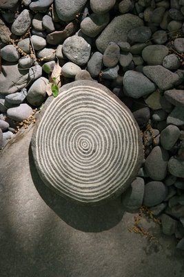
(Tree Rock)
Norm Magnusson is a New York based artist, situated near Woodstock. Magnusson is an artist that uses many forms of media to get his ideas and visions across. In the series I have been looking at, 'Decorating Nature' he paints on, or adds colours to different pieces of nature from stones to leaves. He does things like adding colour to fallen leaves or patterns and also paints onto fallen pine cones. I would say that the meaning behind his work could be that he trying to bring forward the beauty that is already out there. Sort of like when a person does their make-up they are emphasizing their natural features much like Magnusson does to his own work.
There doesn't appear to be a very complicated technique he seems to just us standard acrylic paint to do his designs and then photographs the nature back in its original setting. I really like the fact that he chooses to do this, as it really makes the pieces stand out from its surroundings. For example like the image above, it's surrounded by all these other stones, but it really stands out not only by its size but also because of its simplistic pattern. 
I chose to look at Magnusson's works as I have done something similar to his work. And I find his work very interesting and refreshing. My first reaction to his work was that he has chosen a very interesting canvas for his painting and this was what struck me the most. I really like his more colorful works, but I also like minimalist ones as well, as I find its a good balance. All in all, I find Magnusson's work very creative and can be easily re-created and I think it would look lovely in a garden, having different coloured leaves and stones.

"Beauty is the best friend of consideration."- Norm Magnusson

Sunday, 2 June 2013

ANALYSIS: (PORTRAIT) JULIE COCKBURN


This is the work done by Julie Cockburn, she takes neglected photographs found at car boot sales, studio shots from 1950's movie stars and pages from american high school yearbooks. Through embroidery, cutting and collaging she makes these found images her own, creating a link between the past and present day. The portraits that Cockburn selects are photographs that were once amazing for their era, however now serve no great purpose and can been seen as being defunct. I choose to look at this photograph titled 'Tattoo Face' because I love its vintage aesthetic and qualities. I don't think that the embroidery defaces the photograph, but instead helps it. As it covers majority of the woman's face and helps to bring out her features which are her eyebrows, eyes and her statement red lips.

To me her work strikes me as having something to do with memory. Being that her work is hand crafted leads me to believe that our memories are all very personal. Most of her significant pieces of work are of women which intensifies both the manipulative and hand crafted nature of the work she produces. Another meaning behind her work could be that we are all just upgrades of our past. She takes images of the past and defaces them to fit in to present day, which is what in some aspects we do. It is all a constant cycle, what is seen as 'cool' now will be seen as rubbish in 10-20 years.

Cockburn's technique to go about making the work is defacement. These both driven by her desire to blemish and/or embellish the photographs. She often embroiders or cuts out shapes into a quite complex patterns, this is very long tedious labor of work which just makes me enjoy and appreciate the photographs more. By manipulating the portrait Cockburn seems to create a barrier between the viewer and the photograph, this may help the viewer keep an open mind when viewing the photograph as they don't have any emotional attachment to them. The colour all the vivid, it's also muted in tone which is to be expected for the era in which the image was taken. The colours are soft and pastel-like which keep a nice light heart-ted image.

I choose to look at this image because I enjoy the nature of being able to manipulate a photograph and creating something totally new. It brings back some form of life, and takes something with little or no meaning and makes it to a very visually appealing photograph. Julie Cockburn's work reminds of the artist John Baldessari although he uses more block objects to cover the face and making the image less personal they still share the common theme of defacing photographs. Cockburn has inspired me very much, in knowing that although something is dated there is no reason why you can not 'rescue' it and bring back to present day, with something so simple as cutting into it.


" I feel have a right to them, that they are mine for the taking, or rescuing even"- Julie Cockburn


ANALYSIS: JAN VAN HOLLEBEN

This piece of work was done by renowned contemporary photographer Jan Von Holleben. He is a Berlin based photographer and his images often focus on his own personal experiences throughout his life. This photograph was from his 'Dreams of flying' series which is what he is most known for. He produced the series since 2002 with children from his local neighborhood in southwest Germany. I choose to look at this particular photograph because of all the amazing contrasts in colour. I am also hoping to make my own inspired piece, using the same themes and techniques.


Jan takes influences from his parents into his work. He focuses on the visual representation of childhood and plays on the concept of 'playing'. He combines all of these alongside his personal experiences and childhood memories. "The best feedback I get from people on a regular basis is, that I make them very happy. Maybe that is a hidden meaning?" There may not be a clear set hidden meaning behind his photographs, but many say that is bring them joy and happiness, which in some aspect can be seen as a hidden meaning. The works subject matter seem to be taking what is seen as 'impossible' and making them 'possible'. From flying around on magic carpets to having mystical adventure on the back of your pet dog, Jan's photographs help to bring these all to life. It is a very basic concept, but with a great impact on the viewer. Jan claims that of all of music's history is a major influence for him. "Photography and music are brilliantly analogue to each other. Whatever music can do to your ears and brain can photography do to your eyes and brain." He also says that courageous people with integrity and who believe in themselves help to inspire him. Those who know that they can change the world even with the smallest of actions.


In an interview Jan says that his procedure is as follows: "Fully understanding the subject matter (research), then walking with the idea for some days, starting with some sketches on paper (for myself as memory of ideas but also to explain my team and possible models how my idea works), starting production (which can be a 10 minute shoot in the studio or a two week project or split into various individual shoots depending on project) I am extremely pragmatic about my time and efforts." The photographs seem to be achieved quite simply, I would assume that he stands from a height to achieve that 'looking down on' affect, he possibly stands on a step ladder. The colours of the props in the photograph are very bright and vivid, in contrast to the simple background which is the sand. This seems to be a running theme throughout his other photographer. 


I choose to look at Jan's work because at heart I am a child myself and I appreciate that someone is able to capture all those careless and amazing childhood memories. There is something so innocent and pure about a child's imagination and their ability to make anything possible and Jan captures that perfectly in his photographs. There isn't anything to dislike about his work, as I think it's pieces that can be universally loved by all. This work has inspired me immensely to be a little more imaginative about my approach to photography. I don't need to have a serious subject matter, however have a serious approach to the work to achieve an amazing piece of photography. 

"If you only take good pictures than make it a wonderful hobby. If you understand what you do and see a point in sharing that with the world, then rock'n roll!" - Jan Von Holleben

CHEMIGRAMS


This a simple stop motion animation which I made showing the process of making a chemigram. A chemigram follows some of the basic principles as a photogram does, however the major difference is that in the chemigram process the photographic paper is exposed to natural light.
There are two ways of making a chemigram, both achieving a different look. 
The first way is the one I did above, which was simply getting the exposed paper, dipping my desired objects into the developer solution, pressing the objects for about 10 seconds and then placing it into the stop, fix and then proceed to wash it. This method of doing the chemigram achieves a look, in which the space where the object was placed to be black and the background to be lighter. This helps to show a little more detail in the object.
The other way of creating a chemigram is to dip the objects first into the fix solution, and then placing it into the developer, then stop solution and then washing it. This darkens the background and leaves the space where the objects placed white.


These are my chemigrams which came out better. They are all of different leaves which I had previously made a composition sheet in order to make it easier to know where to place the objects as and also to help differentiate my prints from the rest of the group. I mainly used to the first method of creating the chemigrams as it was my preferred way and also it showed more detail than the other, however the last one I used the second method, and to my surprise it came out pretty good. 
All in all, I do quite like chemigrams as you never know quite what your getting and its that element of surprise which makes them interesting to see and make.