Tuesday 19 March 2013

COMPARISION: JUERGEN TELLER & MAN RAY

Juergen Teller


Bjork, Spaghetti Nero, Venice 
This is a photograph of famous Iceland singer-songwriter Bjork, photographed by Juergen Teller. I am not quite sure what is the actual meaning to this photograph, as Bjork is seen to be eating black spaghetti which looks to be done using squid ink. 
This to some may look weird and disgusting, but to a person such as Bjork, this is what happens in 'her' world. I think this photograph is one of the many reflections of her personality, as she is not one to opt for what is considered 'normal' in today's society. 
The subject matter of the photograph may not be seen as realistic, as it does look quite disgusting but to me that is what makes the image beautiful. It is definitely  quite abstract as is much of Juergen Teller's work.
In the exhibition this image was part of massive collage which was done in a small room covered in different images. This image was at the top of the room, and it  immediately stood out to me.
Although the image is in colour, the usage of it is very minimal/ if at all there. I think the usage of the monochrome, black and white works really for the image as it adds to that 'disturbing' effect it gives off. The white plate, table and plate help to make the black really stand out and become the main focus.
I think that the mood of all of Teller's work really push the boundaries of photography and of what is seen to be 'acceptable' by society. He adds a very modern twist to his images adding to how striking they are. Although he does many photographs for fashion designers which are most of the time very glamorous and heavily edited, he does have that side which just wants to forget about the norm and do more.


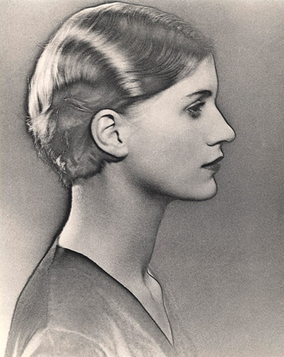
Comparision to Man Ray


Solarized portrait of Lee Miller, 1930 by Man Ray
This beautiful portrait is the work of Man Ray. Both of the photographs differ greatly, as in one you get the quirky and unique Bjork and in the other you get the very classy photographer Lee Miller.
I actually don't think I can choose which is my preferred photograph as both deliver amazing qualities. One hand you have a very modern digital photograph taken in 2007, but the on the other hand you have a film photograph which then has been solarized taken in 1930. 
Since they were done in two very different eras, there are clearly going to be changes, however Man Ray's solarized photograph of Lee Miller is really astonishing. It seems to have the qualities of a drawing but then it comes to you that it is in fact a photograph, this technique really defines details, such as facial features, hair clothing etc. Also, the period time Man Rays photograph was taken, it was a time were woman were very classy, and demure and this in turn is reflected in the photograph. As Miller has been photographed by her side profile, has very sleek glamours and seems to be covered up. Whereas Teller's work in the 00's Bjork, has her mouth opened with food pouring out, her hair is a bit crazy and her dress has mesh panel which reveals her cleavage. 
In conclusion, I personally like both for different reasons, but I really admire Juergen Teller's boldness in his work and how he moves out of that mold of being normal and doing what is considered to be socially acceptable. However given the time in which Man Ray worked, his work has played a huge part in today's modern day photography, and given the work he was doing at his time its amazing to see that his work is still recognized today.

REVIEW: MAN RAY- MAN RAY PORTRAITS

This exhibition show cased the famous portraits done by Mr Man Ray in 'The National Portrait Gallery'. The exhibition tells us the story about his career in Paris and his home town America. It was nothing compared to the Juergen Teller exhibition, it was a lot more classy and polished. I felt so inspired by his work, and it was amazing to see the 'early' works of photography right before you. I especially liked the solarized photograph of the beautiful Lee Miller, I also liked the photographs of the famous Coco Chanel
I personally liked how the exhibition was set, the dim lighting really helped to bring out the photographs, I also really liked how personalized some of the photographs were. By that I mean, some of the photographs seemed to have tears and scribbling of writing  which I assume were Man Ray's writing. This to me just made the exhibition that more beautiful.

Monday 18 March 2013

REVIEW: JUERGEN TELLER-WOO

The 'woo' exhibition took place in the 'Institute of Contemporary Arts' and was done by photographer Juergen Teller. The exhibition is said to "provide a seamless journey through his landmark fashion and commercial photography from the 90's, presenting classic images of celebrities such as Lily Cole, Kurt Cobain and Vivienne Westwood, as well as more recent landscapes and family portraits." I really enjoyed the exhibition, although some pictures were a bit in your face, but that's what I liked about it. I liked the quirkiness of the pictures and how each had a different story tell. 
I especially liked 'The Fox Reading Room' it was a room covered in photographs of different people and celebrities. It was in the form of a massive collage and in my opinion it was a lot more striking than any other 1 photograph would be. There was so much to look at and all photographs were different.
All in all I thought the 'woo' exhibition was really good.

Friday 15 March 2013

ANALYSIS: RON GALELLA

Ron Galella- 'The king of Paparazzi'

Ron Galella was born January 10th 1931. He is an American photographer and is most commonly known as a pioneer paparazzo.
His work has been exhibited and has gone on many famous tabloid magazine.I have chosen to look at Ron Galella because I think that his photographs tie in very well with the theme Covert and Obscured because his job is essentially being those two things.
He takes discreet photographs of famous people and then exhibits them any way he sees fit.

To better understand his work I have looked at his personal website which has information about him and his work and all his past exhibits

 I would say that his work is mostly portraits of famous people. I wouldn't say his work necessarily has a certain theme, but it could be the thought of invading someone's privacy and catching them doing random acts and going on about their daily life. Majority of his photographs (due to the era they were taking in) are done using a film SLR and therefore are in black and white.

I have chosen to look at his work because I think it ties in well with the theme of being covert and obscured. I like the way he manages to capture these celebrities of guard and at times we see these people for who they are, not all posed up and glammed up as we are made to believe that they are.

Galella's work has inspired me to become a lit bit more risky with my photography and sometimes the unexpected can turn out better.


Ron Gallela inspired:


I essentially did the same thing as Gallela and caught these two photographs of my model in her 'natural' state. The first image was taken using a digital SLR and then edited on Photoshop in black and white to resemble that of Ron Gallela's. The second was done film SLR and it's not as contrasted as I would liked but however, I do like how dark it is. It in my opinion, adds to the mystery of the photograph.

Wednesday 6 March 2013

ANALYSIS: SALLY MANN

This work was done by photographer Sally Mann. Mann, is an american photographer who is best known for her black and white photographs of young children and landscapes which suggest decay and death.
This piece of work was part of an exhibition named 'Immediate Family' in which she takes photographs of her three children Emmett, 12, Jessie, 10, and Virginia, 7. Mann began to capture all her children's stages of growing up and what happens during this important time in their childhood, from cuts and bruises to nose bleeds. Instead of simply taking a photograph, she managed to turn these innocent childhood events into works of art. However many of her photographs of her children are very controversial and not approved by all. 

I choose to look at Sally Mann's work because I find something so innocent and pure about it however it still has this dark twist to it. I think this may be because of the great usage of black and white photography and also she is capturing the "reality" of childhood. It is not all about smiles and sweets.
I read an article done by The New York Times where it talks about her 'Immediate Family' exhibition and this helped me to have a better understanding about the work she does. 
As mentioned I do think that the photographs do become a lot more powerful and striking because of them being in black and white. The dark shadows really help to create a quite sinister mood. 
My first reaction to her work was that it was quite disturbing to look at, however once I looked deeper and saw the meaning behind it and why she did it I found the work very inspiring so I decided to do my own interpretations.

sally Mann inspired:


In my attempt to create work like Sally Mann's I took a few pictures with a digital SLR and then edited them on Photoshop  The first is a simple picture of my niece which I turned into black and white by adjusting the levels, brightness and contrast.
The last three I gave my brother a black eye (i painted it with some makeup to look like such) and then tried to recreate on of sally's photos. I took inspiration from this photo. I again done some simple editing on Photoshop giving two of them a 'sepia' look and then the other one in black and white. I think that I would maybe like to explore these even further and try to take some photographs in different location such as woods and things like that and see what effect I can get.