Monday 17 December 2012

LIGHT PROJECT-MIND MAP


PATRICK ROCHON

Patrick Rochon


After graduating college, that's when Rochon discovered light painting, he had heard about it and thought that he had to try this. He asked some of his friends to pose for him in complete darkness, set his camera to a slow shutter speed on his camera, and began to essentially 'light paint'. 
In my opinion his work is very mesmerising and so creatively done that you can't help but wonder if stuff like that is possible. The concept of light painting is so simple but yet it gives these amazing outcomes. What I dislike about the light painting isn't necessarily the work it's more about the method, as in my personal experience trying to achieve a good light painting is really hard, but once you get a good photograph out of it, it feels very rewarding.

Wednesday 12 December 2012

LIGHT EXPERIMENT: PORTRAITS (2)

Portraits-Edited


These were another set of photographs which I took using a digital SLR camera. I did nothing fancy except for play around with different lighting positions. After taking them, I edited them on a software called 'Camera Raw 6.7'. It is a program which allows you to edit the picture as if it were still in the camera. It is similar to Photoshop but different in the sense that in Photoshop you are slightly limited to how much editing can be done. I did slight changes to the images, for example making the more clearer, adding a bit more exposure(or taking away for those photographs which were a little darker), making the photograph brighter, things like that. 

PHOTOSHOP LIGHT EXPERIMENT


Photoshop light experiment

This was my light experiment using Photoshop. I choose one of my best photographs which I took using a film SLR, scanned it in and then began editing it on Photoshop. I followed a tutorial and this was the result I got. I thought that it didn't come out too bad for it being done digitally. I like the contrast of the black and white photograph and then the bright blue of the 'light' I think that it works quite well.

Tuesday 11 December 2012

LIGHT PAINTING: FIRST SHOOT

Light Painting


These were my first attempts at doing light painting. I achieved this by using a slow shutter speed on a digital SLR camera. The lighting effect was done using laser pens. I thought that they weren't too bad for a first time and weren't as successful as I wanted them to be as some of the photographs are not in focus and the lighting effect was done at random and has no real structure so at times that does make it hard to tell what the image is. However in some cases that can be what makes this technique very different and unique.                     

Monday 10 December 2012

LIGHT EXPERIMENT-PORTRAITS

Light experiment portraits


These were my experimental light portraits, which I achieved using a digital film SLR. I thought that they came out really well, especially the ones with the white background. The contrast with the white background and the darkness of the subject worked really well in bringing the focus to the model. I found however that there were some marks on my photographs when I developed them. This was due to the negative strip being quite smudged and containing all these marks. In the future, I need to ensure that I properly wipe down the negatives and make sure that there isn't anything on it as this has a major affect on the successfulness of the final outcome. However, I do really like my photographs.

PATRICK ROCHON & PABLO PICASSO LIGHT PHOTOGRAPHY

Patrick Rochon & Pablo Picasso Light Photography


Monday 26 November 2012

STILL LIFE EXPERIMENTS

STILL LIFE SHOOT


These were my first set of prints I took, I thought they were quite successful, with just the right amount contrast. I achieved this by shining a small move-able lamp around my object to have different sides which were lit with more light and others with less. They lack in strong shadows but I assume that was just from the position in which I took the photograph which meant you couldn't see it. However all in all I thought the came out good.

ANDRE KERTESZ-EDWARD WESTON

Andre Kertesz & Edward Weston


File:Kertesz The Fork.jpg
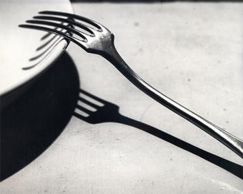
This photograph was taken by Andre Kertesz, named 'The Fork'. Kertesz was a Hungarian photographer. Born in 1894 and died in 1985. The subject matter of the photograph is simply a fork and a plate. I think that there is a deeper meaning in the photograph, as Kertesz has managed to capture simple, everyday objects which we as humans take for granted and has transformed it into something which will stay in the mind for a long time. In my opinion the meaning behind the fork, is that it could represent all the things we take for granted, but when captured in a single moment, we see how it is much more than a simple fork, as clearly we use it to eat, but when we do it brings us joy and how some who don't have a fork will never understand what that joy is. On first looking at it, you don't really quite understand what it is about, and in a way that is the beauty of it, because it makes you think, but then on looking at it and trying to understand you can see that maybe it has some form of a hidden meaning. 

The frame of the photograph can be considered a close up, with the fork being placed sideways on the plate, this creates really good shadows. The contrast in the image is really amazing, how he managed to get the right amount of darkness to compliment the lightness of certain areas. He uses the shadows to his advantage as they are really dark in comparison to the whiteness of the plate and the grey fork. I really like how he has arranged the image , everything seems to be in the right place as if they do belong there. 

In some ways I think the image was planned, maybe to provoke a response from the audience, but then it could also have been spontaneous. Kertesz used very dramatic lighting to cast does really dark shadows, the light seems to have been shone from the above which give the photograph that really nice contrast. I don't think Kertesz did anything much to his photography work, he seems to keep everything true to the original, there doesn't seem to be any cropping in his images or any form of editing as the photograph was taken in 1928 which meant he didn't have any form of modern technology to do anything really fancy to his work.

I think this work makes me really think that there are always two sides to everything. As even though the fork is light and contrasted the shadow it casts is very dark, which could represent us as human begins having two sides, and I think that even though the fork is an inanimate object it too has to sides. As even though its main function is for eating it can also cause harm if used in the wrong way. 


Kertesz's, the fork in comparison to Weston's pepper are quite different. The fork has a very defined form and is very crisp in focus. The lighting is very harsh and very precise, with the shadows falling in the right places. However Weston's 'Pepper' is more contemporary and a lot softer. With having such soft lighting the photograph almost looks like it was made with charcoal. The smudging of the background also adds to this.


I prefer Kertesz photograph as I like that fact that it is very crisp and in focus. The dark areas and light are clearly shown with the use of such high contrast.Whereas Weston's pepper is more fluid and not as contrasted, instead blending the colours together.
                                             

MIND MAP-LIGHT

Light Mind Map


ANALYSIS- DAVID BAILEY

David Bailey


The photograph was taken by David Bailey. Bailey was born in 1938 and is still alive today at the age of 74. He is regarded as one of the best British photographers. I choose to look at the photograph of Jack Nicholson as it seemed to me, to be one of the most interesting of Bailey photos. I also tried to achieve a similar look with my own photographs with the use of artificial lights.

To gain a better understanding into Bailey's work I looked at a magazine article from 'Lomography' which talks about the 'Swinging Sixties' era, which cam about when Bailey and other photographers Terence Donovan and Brian Duffy, began a culture celebrating high fashion. They mainly associated with famous actors, actresses and musicians which resulted in most of his photographers being of well known people. I would say that the genre of the design is definitely portraiture as it is a close up of Jack Nicholson, with the focal point being his quite disturbing facial expression. I am not so sure if there is a theme for this photograph, but when searching for the image I did come across that it was under the label 'Legends', and Jack Nicholson can be considered as such for his iconic movie 'The Shining'. The subject of the work as mentioned is Jack Nicholson a famous actor in hollywood and it is quite likely that the photograph was taken around the same time as the movie, 'The Shining' as this was were he was at the height of his career.

The photograph was captured using a simple black and white, film SLR, which was pretty much all he could he use as at the time the photograph was taken there wasn't any digital cameras. Bailey used a very strong lighting form, with light only shining from one side of his face, whilst the other was quite dark in comparison. I assume he used a fast shutter speed to capture the photograph. The high contrast in the dark areas of the photograph make it seem more sinister and quite scary. Also the shadows in his face help to highlight the wrinkles on his face. His expression seems to be one of pain, as he doesn't seem to be angry because his eyes aren't wide open, instead they are shut as if he is crying. Nicholson's expression in this photograph could reflect his character 'Jack Torrance' in The shining.

In my opinion I really like the photograph the emotion he is portraying is really strong. The contrast of the dark areas and light areas are perfect, there is enough dark areas to bring about that sinister mood, however there is enough light areas that you can still see the details in his face. Since knowing each other I would associate Bailey's work with that of Terrence Donvan. Bailey's work has inspired to be more adventrous with lighting and to use it to my advantage.

Monday 12 November 2012

STILL LIFE

Still Life Photography


This piece of photography is done by Andre Kertesz- The Fork.
Kertesz was Hungarian, 1894-1985. His image, The Fork (1928) was is Kertesz most famous work from this period. It was taken with an SLR Film camera in Black and white. The light seems to be shone from above because of where the shadows is placed and the light areas seem to be more on the tops of the fork.


Photograph by David Bailey- The Rolling Stones. Bailey is a british photographer born in 1938. Most of his work was done around the 1960's, they are also mainly black and white. He photographed many celebrities and done images for Vogue Magazine.  The light in the image of The Rolling Stones is mainly on the faces, they are also wearing dark clothes which helps with the contrast between the light and the dark. The background is also dark.


This photograph is done by Edgar Martins from the Dimishing Project 2003/2005. He is a Portuguese photographer but works in the UK. He likes to take pictures during sunrise, day time, night time. He takes images of street lights, cars, runways, and he also visits location which means he uses natural light.


Picasso light painting- centaur. Picasso is spanish 1881-1973. The photograph was taken in a dark room, using 2 cameras, one for side view and the other for front view. He left the shutters open  which meant he was able the catch the light streaks swriling.


Wednesday 7 November 2012

EVALUATION- EVERYDAY LIFE

Evaluation


I was quite pleased with my final prints, I think that they are quite 
contrasted due to them being in black and white and the subject links to the theme of everyday life. However I was displeased that my coloured photographs didn't come out as well as I had hoped, they were either too dark in some places or not in focus, so instead I decided to stick to my black and white prints. I did find that taking the photographs proved to be a challenge because each time I had to ensure that the lighting was good and that the image was in focus which is quite hard to do on a film SLR. Also developing the images wasn't too difficult, however making sure that you exposed the film for the right amount of time and had the correct filters on was a bit of hassle and at times I did forget to check everything which could have been the cause of not having very successful images. I enjoyed all the techniques I was taught throughout the project, especially the slow shutter speed because I really do think that it makes the image more alive and and adds a lot of movement if done right. If I had to do anything differently it would be to retake my coloured film photos, because I was really disappointed when they didn't come out like I had hoped and also because I really like the theme I was given and also looking at Tom Wood's coloured photographs I had hopes mine would turn out similar. As mentioned I was really influenced by Tom Wood's photography because his work is pretty much about capturing normal everyday life as that is the basis of his work. but also the black and white nature of Jason Martini's photographs.
Overall I really did enjoy the project, and also the theme was really good, I hoped we were given a little bit more time to take all of our photographs though.

ANALYSIS [FINAL PIECE]- TOM WOOD

TOM WOOD

This amazing photograph was taken by Tom Wood. Tom Wood was born in Ireland, 14 January 1951 and is a street photographer based and working in England. He has had solo shows and his work has been collected in five books. This photograph is called 'Mirror Mersey' and was taken in 1989. The work was exhibited in the Photographers Gallery and it was the first major UK show of photographer Tom Wood, since 1973 until the early 2000's. The exhibition was simply called 'Men and Women'. I choose to mainly look at Tom Wood's work for my final piece as I felt really inspired by his photography and I really liked the retro vibe it has. Also because it was taken at a different time period, the fashion is obviously different and I think this also adds to the retro-ness of the pictures.  
To better understand Wood's work I looked at the whole collection of photographs for this exhibition.
I also read an interview he did for the guardian which also has mentions of the Men and Women exhibition. 
"I'm just interested in good photographs," he says, shrugging. "I'm not a documentarist. I'm not trying to document anything. It's more about deciphering and transforming. I make what you might call real-life photographs."
In my opinion Tom Wood's work are portraits but some could argue that it's not. I think that the main theme (if there is one) is everyday life. His photographs are just of people living their everyday life and he happens to come along and take a photograph. I don't think there is a deeper meaning to his work, as he says he is only interested in a good photographs and he doesn't want to seem like he is documenting these people. 
I don't think that Wood's photography isn't too complicated and he hasn't used many fancy tricks, he simply just saw his subject, insured the light was good and snapped away. Although for some of his shoots were it gives the illusion of movement he may have used a slow shutter speed to capture the movement. The colour of his photographs has got to be my favourite part of his work, I really like how the clothes due to their era are quite bright in comparison to the background.
I choose to look at his work because I really like the era that his pictures were taken and how much colour there is in his work. This work had inspired me to think a little less about trying to achieve the perfect picture, I also liked his subject matter of catching everyday people go about their lives.

Monday 15 October 2012

FINAL PIECE MOOD BOARD

Final Piece Mood Board


ANALYSIS- MAN RAY

MAN RAY


This piece of art work was done by Man Ray. Born Emmanuel Radnitzky, August 27,1890 and died November 18,1976. He was an american modernist artist who spent most of his career in Paris. He was a significant contributor to the Dada and Surrealist movements. This piece of work is called 'Gun with alphabet stencils'. It's a photogram or 'Rayographs' was the term Man Ray used for his photograms. The work was done in 1924. I chose to analyse this piece of work because we were looking photograms,and Man Ray considers him self one of the pioneers of photograms and we used pretty much the same techniques.
To better understand Man Ray, I looked at his other pieces of work.
And also at his own website Man Ray Website
"I photograph the things that I do not wish to paint, the things which already have an existence."
I would say that Man Ray is very abstract in the way he works, from switching between the traditional form of painting and going on to do some photography, he at times doesn't have a set theme on his work and I admire him for this because it allows him to do his work without any limitations. I don't think this particular photogram has a set theme, it could be one of death because of the obvious gun in it, however there are no bullets in the gun which then contradicts this and may not be intended as something quite dark and violent. I would also thought that the photogram was of children's toys,because the wooden blocks could be made for children and was a toy which was played with a lot in older days and amongst younger children, and then the development from playing with harmless wooden blocks to fake toy guns. Also the round objects could be balls, again something which can somewhat cause some form of violence but is not intended to harm anyone. The title for it is quite basic and only depicts what actually is on the photogram rather than what it is about,so you have to gather your own views on it. 

The technique used by Man Ray was simply, placing the photographic paper under the enlarger, place and arrange objects on the paper and then expose, for proximately 6 seconds. Because the image is a photogram there would be no colour, only the outline of the objects. Not having any colour allows the viewer to add their own colour into the image, making it somewhat more personal and more their own. The formal elements which are quite important in this piece of work is definitely shape, because it tells you what exactly the image is of, and because there is no colour the photogram technique relays a lot on shape. 
I have chosen to look at Man Ray because we have been doing photograms during our lesson and he was one of the pioneers in this technique. My first reaction to the work was what was it about, because from the given objects you don't really know straight away, the objects spark up questions in your mind as to what it might be. What I dislike about the image is the actual technique itself, I don't really like photograms in general because you don't get all the details of the image and you have to sort of figure it out on your own. What I like about the work is that it's completely random and quite expressionist. This particular piece of work hasn't inspired me as such, but it has inspired me to try and do more photograms.

EVERYDAY MIND MAP

Everyday Mind Map


Wednesday 10 October 2012

ANALYSIS- RONI HORN

RONI HORN


This piece of art work was done by Roni Horn. She was born in September 25, 1955 in New York. Horn has been making work since the 70's . This particular work done by her is called " Cabinet of 2001". The pieces of work are photographs, and they were made to be on Flashart magazine. I have choosen to analyse this piece of work because I have been studying shutter speed and this piece of work done by Roni Horn is a perfect example of how to use this little technique and create very quirky and unique photographs. 

The technique used to create this piece of work was using the shutter speed. Making the subject of the image move and then using a slow shutter speed to capture it. This effect is quite effective because it gives the impression of the clowns make up to appear smeared and also makes the images very blurry. There also seems to be a downward light source shinning on the tops of the persons head as it seems to be the lightest part, this then in turn casts dark shadows on the eyes making them seem sunken into the face. She also choose very simple background and also the clowns face match this with only the red nose and mouth making them the subject of the image.

To get a better understanding of her work I looked at a website which showed other of her exhibitions to see what other types of work she also does.
I think that the theme for this piece of work was irony, because, she took something that is supposed to bring you joy and make you laugh and turned it into something that looks quite scary and unsettling to look at. The tile of the piece of work doesn't really help me to make a decision about what the work is about, I had to come to my own conclusion about it. 

I have choosen to look at this piece of work because of the use of shutter speed and how the movement of clowns was captured creating that scary distorted image effect. My first reaction to the work was one of shock because of how scary the images looked, but then on the same hand I thought it was a very subtle way of making an image look quite scary. What I like about the image is how the person in the image cannot be identified therefore it leaves you wondering who the person actually is. What I dislike about the image, isn't the image itself but the fact that you can't tell what the image is about. The work has inspired me to try and do more images using the shutter speed technique because not only can you get images of actual ,movement but also to create something quite scary.


Sunday 23 September 2012

JUSTIN QUINNELL-ANALYSIS

Justin Quinnell


Justin Quinnell lives and works in Bristol. He holds his own workshops and lectures in which he tries to inspire others to have a go at pinhole photography and make their own photographs more unique and contemporary.
The piece of work I have choose is this called 'Brushing my teeth with a dead spider' which is a piece of photography. I choose this piece of his work because I love how different and quirky it is. The fact that you get the view from inside his mouth makes it seems more personal and more life everyday life.
ARTICLE ON JUSTIN QUINNELL
JUSTIN QUINNEL WEBSITE


To better understand why he does this I read an interview he did all about his mouthpiece photographs, and also his own website which you can find all of his photographs, how to make your pinhole camera out of objects you can find in your home among other things. "So I took one of my 110 cartridge pinhole cameras, which was designed to be thrown off a building or attached to a shuttle cock and put it in my mouth,It fitted right at the back perfectly." I would say that the theme for Quinnell's mouthpieces  can come under many things, such weird, quirky,different, but I think that main one may have to be everyday life. This is because this collection of work are pictures from the inside looking out which makes it more personal for the viewer, (some may say a little too personal). I don't think anything inspired Quinnell for these wacky photographs, I believe that he, himself is his own inspiration, the idea of taking photographs with his mouth simply just came to him, " I was sitting there one day with my pinhole camera and I thought, I wonder if this fits in my mouth" 

The material Quinnell uses is a simple pinhole camera, which made by placing aluminum foil over a tiny hole one fifth of a milimetre wide on the film cartridge. Some of the colours in his work seem to be over saturated, so they look more exaggerated. Also the view looks like a fish eye effect. The size of his photographs are also not that big, in fact they are rather smaller and I think by having them being small it makes the eye focus on just the image and the meaning, whereas if it were larger it could be a bit much to look for . I think the most important formal element in Justin Quinnells work is colour, because they just make his work even more exciting, because they are over saturated and exaggerated they just make everything in the image stand out, and also the background in his mouthpieces are sometimes dark make the image itself stand out. 

I have choosen to look at Quinnells mouthpiece photographs, because they are unlike anything I have ever seen before, the perspective is different and amazing at the same time. My first reaction to his mouthpiece work was that it looked revolting only because all I was seeing was his teeth in the image, however once I over looked that I found that his work is in effect very creative and very interesting to look at. I mainly like the fact that he could have choosen to just placed the pinhole camera on the floor and take the image, but to go that extra step and put it in your mouth and capture the world from your own point of view makes the whole thing just even more amazing. I don't think there is an artist out there that has work even close to look like Justin Quinnell's just because its so unique. His work has inspired me to be more creative with my photograph taking, pay more attention to colour and also think about perspective and how you would want others to see your world through their eyes. 


Wednesday 19 September 2012

PINHOLE CAMER PHOTOS: PHOTOSHOP EXPERIMENTS

Brightness/Contrast


For brightness and contrast not much was done expect adjusting how bright or how dark you wanted the image to go. This can be quite useful as it can help to bring out more details in the image for example the tops of houses or the leaves on trees, however how much of a good job it does also depends on how dark/how bright the image was to begin with.


Hue/Saturation


For hue and saturation the effect is a lot different as here you can change the colour of the image completely. You first have to press colorize if your image is in black and white in order to get any colour on the image. this effect is great if you want to give a different look to your image and also it can add emotion to your image as well for example, if you have photographed someone being happy you can use bright colours to add to that. 


Photofilter


The photo filter tool is quite similar to the hue and saturation in the sense that you can change the colour of the image and again give it a new look. Also on this tool certain affects are already provided for you so you can always use them and then adjust them to your liking.