Friday 6 December 2013

DIGITAL EXPERIMENTS: ANDY WARHOL


This is my Andy Warhol inspired piece I created using Photoshop. I chose this photograph I took of my cousin skateboarding because I really liked the original shot with the skateboard in the air, and I thought it would look interesting as a Warhol inspired piece. 
To achieve this effect I first placed my image into Photoshop and used the 'Threshold' tool to simplify the photograph, giving it a more cartoon like effect. I then selected the paint bucket tool, along with my chosen colour and painted the parts of the image I wanted in colour, I repeated this process four times.
I am quite pleased with my outcome and really liked how the four images look together. 


Thursday 5 December 2013

DIGITAL EXPERIMENTS: ANIMATED GIF


These are some GIF examples I made using the 'animation' tool in Photoshop. I really like the effect and I am possibly thinking of  taking this technique further for my final piece. 

Monday 25 November 2013

EVALUATION - ENHANCED IMAGE PROJECT

The design brief for my 'Enhanced image project' was designed to teach further dark room techniques, and to encourage the exploration of enhancing images through various experimentation and new methods learnt. The theme for the project was my own chosen pathway (documentary) which I had to stick with through out the whole unit. 
The outcome I produced was a form of 'installation' which I used a bin for. I used liquid emulsion to print my work onto various different pieces of 'rubbish'. I then displayed them onto a bin and took a photograph to accompany my whole installation. I chose to print my photographs onto rubbish as my photographs were all mainly taken in the more 'grittier' parts of London; what some may call the 'slums' or look at as rubbish. So I decided to play on this idea with my final piece.

The materials I used were as mentioned, the liquid emulsion which I used to print my photographs with and various different pieces of rubbish. For photograph which I mounted I mainly used the dodging and burning technique I learned at the beginning of the project. That specific technique really helped to enhance my already contrasted photographs and make them resemble that of my chosen artist, which I looked at for inspiration. 
For my final outcome I researched a lot of different installation pieces and sculptures. I looked at artists such as Annette Messager for inspiration as I previously I was going to create a piece much like her hanging installations. But later I decided against it as I wanted something a little more contemporary. I also researched different types of surfaces which liquid emulsion worked best on, as I had never used it before and didn't know what to expect. There weren't many photographers that I could find using liquid emulsion, but the few that did seemed to use very light materials such as paper or thin pieces of cloth. Also very importantly I did quite a bit of research on the person who most inspired my photographs, Daido Moriyama. I looked at his different pieces of work and read some of his interviews in which he talks about his work.
To try and meet the deadline, I tried to ensure I had some form on plan in my head as to where I was trying to go with my work. I ensured I took all my photographs on time to allow me enough time to fully experiment with them. I also made sure I mad every picture count, as I did not know how many would actually turn out good enough to use in the final piece. 

In general I think most parts of my process worked quite well. I thought that the dodging and burning of my photographs were quite successful and proved to be an important part of my process. Also when I finally got the the liquid emulsion to work in my favour, that too was quite successful. I got enough of the photograph so that you can make out what it is, but then I have not included all of the image to give it a more 'aged' appearance. 
I think what would make my outcome a success is that everything more or less goes with each other. The is a running theme through out the whole piece and it all corresponds to one another. 
In my opinion I would say I've met the brief as I experimented with most of my photographs and have learned new techniques which I can apply later on in the course. I also explored and applied these new techniques into creating a final piece by the end.

As with anything I did find some problems along the way. One of which kept happening a lot of the time is my photographs being out of focus. With this being an issue a few of the photographs which I liked could not be used due to this. Also due to the lack of time I didn't have enough time experimenting with the liquid emulsion. This resulted in me having wasted a lot of my time seeing what materials the liquid emulsion worked best on. If given more time I would definitely experiment with different materials to see which worked best with the liquid emulsion. 

I learned many new skills which I hadn't before. I learned dodging and burning, vignetting, solarisation and combination printing. I had already tried solarisation before and therefore I almost improved on that. 
Overall I thought my outcome was quite successful in achieving what I set out to do which was to learn and apply these new techniques which I had learned through out the course and I would say my final outcome reflects this.   

Thursday 14 November 2013

FINAL FILM: PHOTOGRAPHS


These are the first few photographs which I have taken and developed as part of my final piece. My main inspiration has been Daido Moriyama with his high contrast photography and candid imagery.


For this photograph I first did a test strip, but then I thought it looked quite good as a test strip with the contrast of it going dark to light, so I figured out the time for it which was 10 seconds, and then covered each side for about a second. But whilst I was doing this I made sure I shook the piece of card I was using to cover the sections in order to get a smooth transition of colour, otherwise had I not shaken it, it would have block lines of colour. 


Whilst it was raining I took a photograph of a puddle which was reflecting a tree, I really like this photograph and how dark it is, I think it really reflects the mood at the time the photograph was taken.


I took this photograph from the back of the passenger seat in the car. I was looking in from the little space there is on the drivers seat. When I originally processed this photograph, the middle where you can see the lamp posts where completely white, and you couldn't just make out some details. So I burned the middle of the photograph for an extra 8 seconds from it's original time to get this final photograph.


This photograph, again I took when it had just stopped raining and this gives the ground a lot of light and an almost gloss like look which I think works really well with the contrast look I wanted. I like the really dark of the alleyway with the contrast of the white from the shutters in the shop.


I quickly took this photograph as I was crossing the street, so I didn't really have much time to figure all the settings. However I thought I ended up with a decent photograph.


These were a few posters which I saw whilst walking down a street. I didn't have any typography images so I reckoned this photograph would help fill that 'hole'. When I first processed the photograph the posters around the side weren't as dark as I wanted, therefore I burned all the corners to make them darker; revealing a lot more detail. I decided to burn the photograph rather than expose the whole image again but for longer time because the white in the middle was just becoming too dark,and the contrast between the writing and the background was beginning to get lost.


For my final image I took this one of a few fans which I saw in an alley way. I am not sure what appealed me to take the photograph, I guess it could've been the composition of the fans themselves which I thought looked really cool, but the end result I thought was quite successful.


ANALYSIS: DAIDO MORIYAMA


Daido Moriyama is a Japanese photographer who is known for his photographs depicting the breakdown of traditional values in post war Japan. This photograph is called 'Shinjuku'. I chose to analysis this piece as its strong contrasts and mysterious look attracted me to it. It's a little hard to make out what exactly it is and this just makes the photograph 'that' more intriguing. 

In my opinion I would say that Moriyama's style of photography is very gritty and almost careless in certain aspects. It can definitely be compared to the works done by William Klein, who happens to be one of Moriyama's most influential photographers. I think the theme of Moriyama's work is 'gritty' street life and capturing Shinkjuku street life. Moriyama describes his photography as gestures of his internal desire. As I believe his photographs aren't merely records of Shinkjuku they are far more personal than that. "There are many desires inside, and I don’t really care about social systems or the world’s view. My photography is rooted in my personal desires, so it is natural that it gets personal."

In an interview Moriyama says that he prefers to use small compact cameras as a pose to big bulky SLR's.“If you use a SLR, you see things like this [holds camera to eye]. And when you do this, you want to have perfect focus. The moment which you want to capture does not fit your feeling, if you do this. If you are using a compact camera, it is simple[While holding SLR to eye] Also furthermore, if you [use a SLR in front of your eyes] many people in Shinjuku, people turn their faces, or flee.” The benefits of shooting with a such a camera is that you wouldn't have to worry about focusing or things such as exposure since the camera would do all the work for you. What Daido says is that by doing it this way it allows the photographer to focus more on the nature of the photograph and all the feeling it carries, rather than the camera settings. Another benefit of Daido's method is that it is less 'threatening' to the public and therefore allows for more candid photography. 
A lot of his documentary work is in black and white and it is highly contrast. This really allows the photographer to captivate the viewer rather than distract them with a lot of colour. The use of black and white in his photographs give off a very mysterious and almost erotic mood to his photographs, some more than others. “The reason why I think black and white photography is erotic is completely due to my body’s instinctive response. Monochrome has stronger elements of abstraction or symbolism. This is perhaps an element of taking you to another place. Black and white has that physical effect on me. That’s just the way I respond to things.” We already see the world in colour, therefore capturing photographs in black and white is form of break from that, the photographs in turn become a lot more symbolic and meaningful. 

I choose to look at his work as I've always had a big interest in documentary photography and when I was told to look at Daido Moriyama's work, I instantly thought that I wanted to create a final piece inspired by his work. He is very unpretentious when it comes to his photography which is what I think makes his work unique. His approach to his work is very casual with the use of his simple compact camera. The thing which I find most inspiring about his work is that he doesn't simply snap a photograph, he always has some personal connection with each image; he wouldn't simply take a photograph just because it was appealing to the eyes. 
Moriyama's work has inspired me to slow down on the notion of trying to achieve the 'perfect' image, don't think about the camera settings too much as this will distract me from actually taking the photograph.
"The photos you take are a self-portrait of yourself, not others"

Monday 4 November 2013

LAYER BLENDING


To achieve this effect I used the Layer blending tool in Photoshop and this link to create the effect. I simply combined a bunch of photographs which I took during the summer, I thought it would look quite cool if I combined black and white photographs with colour ones, this is in my opinion worked quite well and gave a really good contrast between the dark photographs with the more colourful ones. 

Wednesday 16 October 2013

DIGITAL SOLARISATION


These photographs I took during the summer, and decided to turn into coloured solarisations. I did this by using the curves tool in Photoshop and creating a reversed 'V' to create the effect


These are black and white film photographs I took as part of my first roll of film. Again I did the same technique using Photoshop.

Thursday 26 September 2013

ANALYSIS: LESLIE DAVID


This is the work done by Leslie David and is part of her 'Souvenirs de Paris'. Leslie David is a graphic designer, art director and illustrator based in Paris. The photographs are actually of different Parisian sceneries, they are in black and white and are of monuments from dated archives. The photograph is really simple in style, only with he bright block of paint which immediately captures your gaze. David stated that she wanted to associate the unexpected colours and relief of the paint with the romantic feel of the photographs.

The photograph itself has been shot in portrait and does not appear to have been taken at any 'unusual' angle. However the position of the paint has been put in the corner of the image. This I think is so that it only partially covers the photograph leaving space for the viewer to look at the photograph and identify with the monument. I do like the position of the paint as it doesn't cover too much of the photograph to the point where it no longer looks like a photograph but a painting.

I really like these series of photograph as it is taking something which looks relatively plain and simple and brining it back to life by adding some colour. I like how the colours of the paint bleed into each other forming different colours and it makes the transition from colour to colour look more seamless. 

ANALYSIS: ANNETTE MESSAGER


This is the work of Annette Messager. Messager is a French artist who was born 1943, she is mainly known for her installation work which she then incorporates photographs and various other materials. The subject matter for this installation appears to be the human body. I think this work addresses quite a taboo subject which is nudity and also the human body in itself. As of recent years society has frowned upon what is not considered to be the "perfect" body type. And in this installation Annette photographs all different body types both male and female. I think the meaning of the work is quite obvious although it can be interpreted in different ways. Some may say that it is in some aspect "celebrating" the human body whilst others may disagree. 

All of the photographs seem to be close ups of the different parts of the human body. The photographs are arranged into a circle installation. She has kept her photograph really simple with limited contrast. The photographs were taken against a black background as to not to distract the viewer from the main focus which is the body parts. Overall I really like the way she has chosen to present these series of photographs, it's very different and a lot more exciting to just simply putting them on a frame.

The photographs look as if they have been posed for example some of the mouth shots looks posed. Again she has kept her photographs quite simple as her main area is in installation. However some of the photographs seem to have more of a brown-ish tint them whereas others look more black and white.

Overall, I do like this piece of work, it's very interesting in terms of the subject she choose to photograph and also the use of an installation to display the photos works really well. I think what the artist was trying to convey here is that everyone's body is different and we all vary, and so having this displayed as a massive installation piece really helps to engage the viewer with the piece.


ANALYSIS: JEFFREY WOLIN


This is the work done by photographer Jeffrey Wolin. It is part of his 'Written in memory' series and this is one of the portraits he took for his 'Portraits of the Holocaust'. The subject matter of his photographs are survivors of the Holocaust and he depicts their story not only through photographs but he also adds to them by writing the person's account on the holocaust. These photographs address the mental state and courage of these survivors and gives them some form of 'closer' by giving them voice to speak about these memories that will forever haunt them, and finding a creative way to release them. The subject matter is treated very realistically and is no way manipulated to create some form of abstractionism. At first glance, one may not be able to understand fully the meaning behind the photograph. You can gather that it may have something to do with loss, since the subject is holding a photograph of a child and is looking down on it, however it is not until you read the text which surrounds the subject that you fully understand the photograph and its meaning. 

The photograph is a close up shot of the subject. There isn't much in the background, apart from glimpses of what seem to be windows, so I assume she is inside a house. Also the photograph gets lighter the more it comes closer to the subject, it looks as if she is radiating this light, whereas it gets darker the further it gets. The photograph is quite contrasted with the woman being lighter than her clothes and also her background being quite dark. I think this works really well, as to me it gives the impression that she has overcome so much through out her life time and all the darkness that once surrounded her is slowing fading away. 

I think the photograph, although posed it was done with true feeling form the photographer and the subject since it is dealing with such a controversial subject. The photographer seemed to have used a wide angled lens, I assume this was because he wanted the focus to be on the subject matter and also since he writes on top of his photos, if the background was too busy you wouldn't be able to make out what he had written. I am not too sure how he added the text but it does look handwritten and not something which is computerised, so I assume he wrote directly onto his photographs.

 I feel as if these people finally have the confidence and freedom to talk about something which dramatically affected their lives and having someone present it in a photograph just reinforces the idea of remembrance and the power that photographs poses. The words of the survivors are etched on the photographs like tattoos and is something that no one can remove.


Tuesday 17 September 2013

PERSONAL STUDY: DOCUMENTARY PHOTOGRAPHY


( These are the photos which I thought worked a little better, so 
I decided to edit them on photoshop)

For my own photographs I went down to Brick Lane and Camden to take some 'candid', street life photographs. The first few photographs I took in Brick Lane, I wasn't too sure on wether or not I was going to focus more on people or subjects such as buildings so I decided to take a few photographs of the graffiti, which were amazing works of art. For the second half I went down to Camden and took photographs of the passer-by'ers and did some more candid photography. I enjoyed taking the candid photographs as I found it fun capturing people doing different acts, however It sometimes become a little repetitive. To improve, I would like to get more face shots, rather than back shots and also I would like to take more inspiration from William Klein. 

Thursday 15 August 2013

PERSONAL STUDY- PIONEERS OF DOCUMENTARY PHOTOGRAPHY

I've chosen to do my personal study on Documentary photography. I choose to this because I really enjoy capturing and telling stories through photographs and documentary photographers really manage to capture the emotion and feeling in their photographs.


Eadweard Muybridge


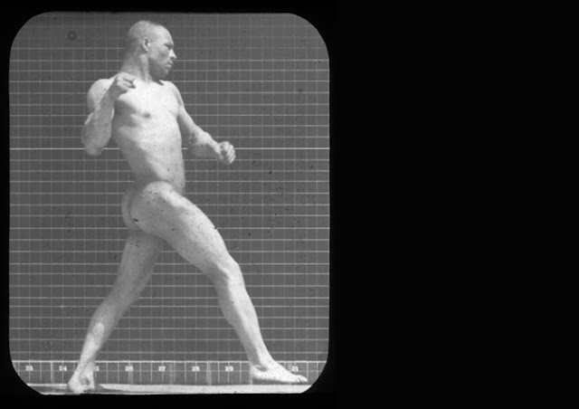
'Man Punch'

This photograph depicts Ben Bailey a mixed race male, Muybridge's only non-white model. This was the first photograph in which Muybridge used an anthropometric grid and he never photographed the human figure without one since. The grids were said to be used in 19th century ethnographic photography to study non-western bodies, showing the physical differences to signify lack of civilisation to westerns.


Henri Cartier-Bresson


'Pavement school, Jaipur'

This photograph focuses on a teacher instructing his students on the pavement of a street in Jaipur, India. This photograph is a perfect of example of Cartier-Bresson's devotion to representing human dignity and kind-heartedness. Cartier-Bresson often worked as an anonymous observer amongst the crowd only to be identified by his simple 35mm camera. 


William Klein


'Gun 1 New York, 1986'

This may be on of Klein's most visually 'striking' pieces of work by what is depicted in the photograph. Here is what seems to be a normal New York street child who happens to own a gun. This picture really stunned me, not only because there is a child holding a gun, but by the brutality and emotion he is showing in the photograph; he seems to be holding the gun with absolute purpose and meaning. Although the moment looks pretty raw and gritty, the photograph was actually taken due to something Klein had said to the child which was "look tough" to which the child responded by turning around and pointing the gun straight at him. Giving off this immense brutality.  

Alexander Rodchenko


Girl with a Leica, 1934
Rodchenko did more than take pictures, he wrote long and detailed manifestos to go alongside almost all of his photographs. He tediously promoted the concept of Russian Constructivisim to the rest of the world. I choose to look at this amazing photograph of a young woman sitting. Although the concept of the image is very basic, the way in which Rodchenko managed to capture the shadows which fall perfectly on her body is astonishing. 


Friday 26 July 2013

Wednesday 26 June 2013

HAND-MADE EXPERIMENT: NORM MAGNUSSON


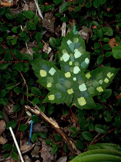
These are my Norm Magnusson inspired photographs. For these I simply got my self some leaves and some acrylic paints and painted on them. They are really simple to do and very fun. For the first image I tried to do different tones of the colour green which of course is the colour of the leave. I then decided to place it amongst green leaves which I thought would help to sort of camouflage the leave but also at the same time make it stand out from the others. For the second photograph, I just did some random swirl patterns with the paint, because I thought it worked better with the orange colour of the leave. I then photographed the leave amongst a brown background which helped to make the orange leave stand out a lot more.